
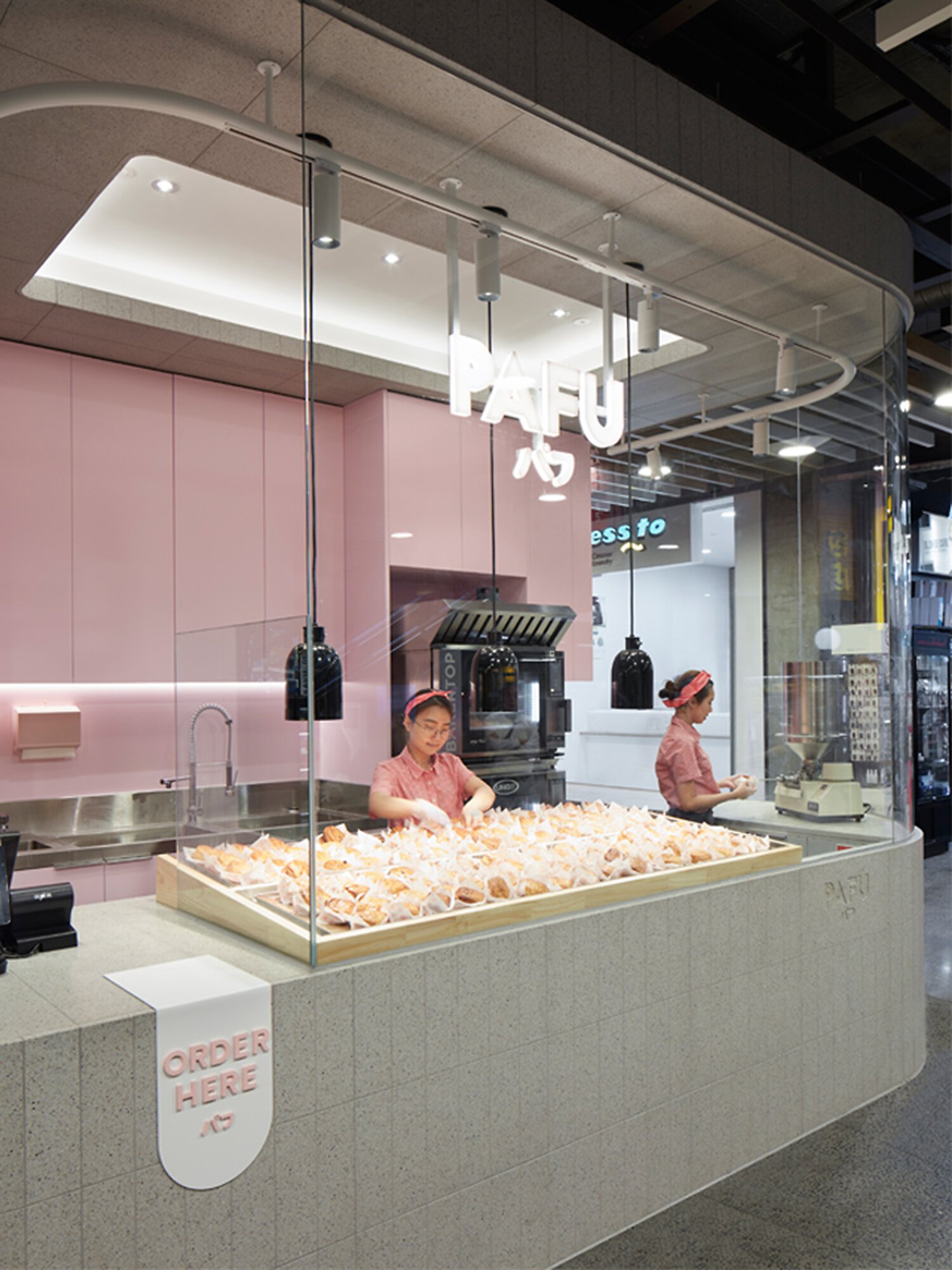
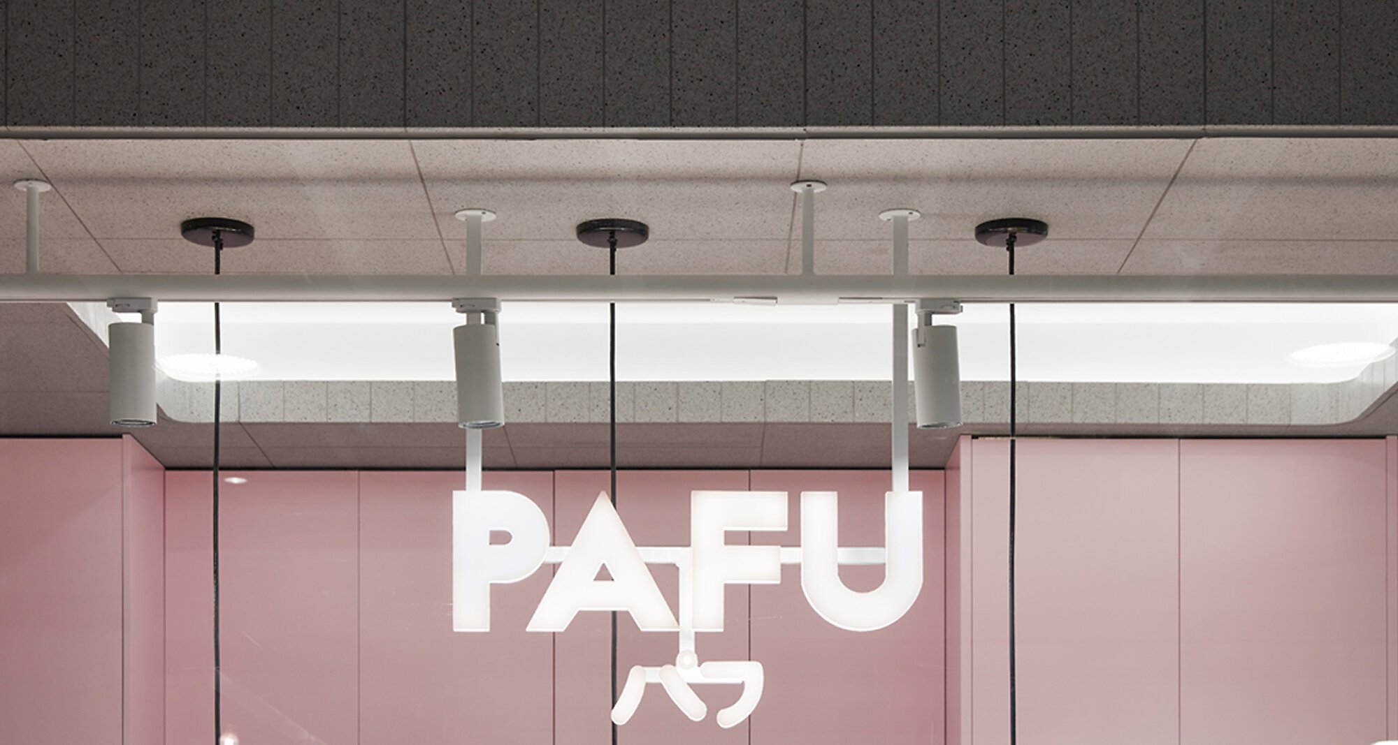
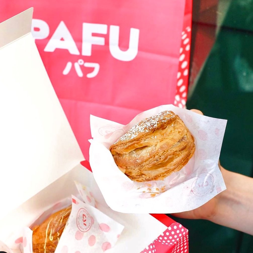
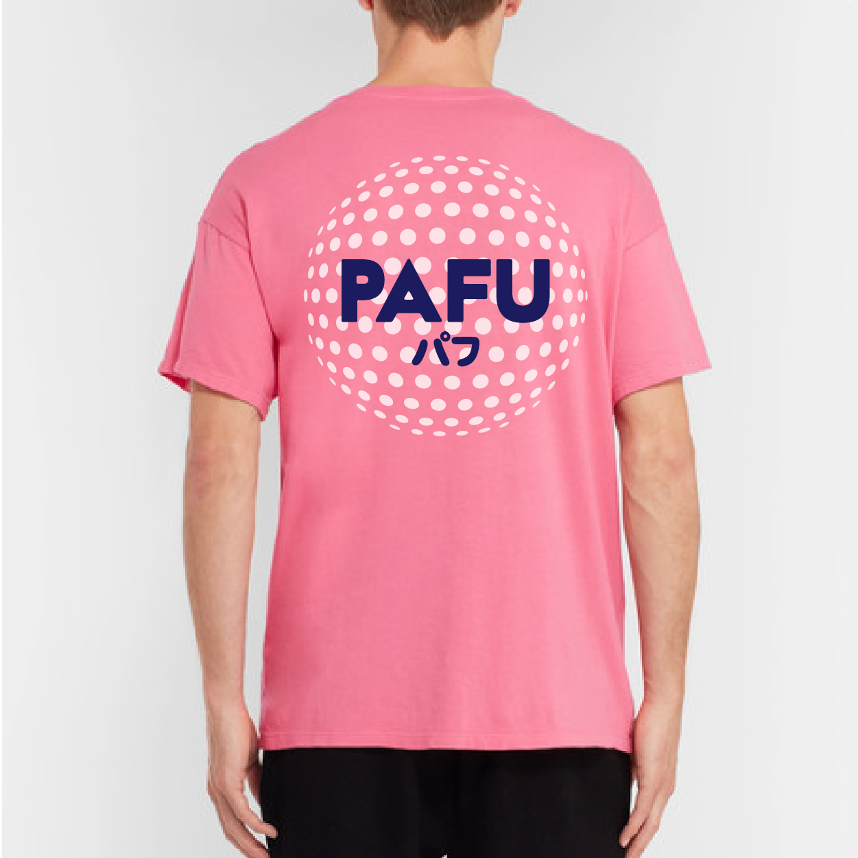
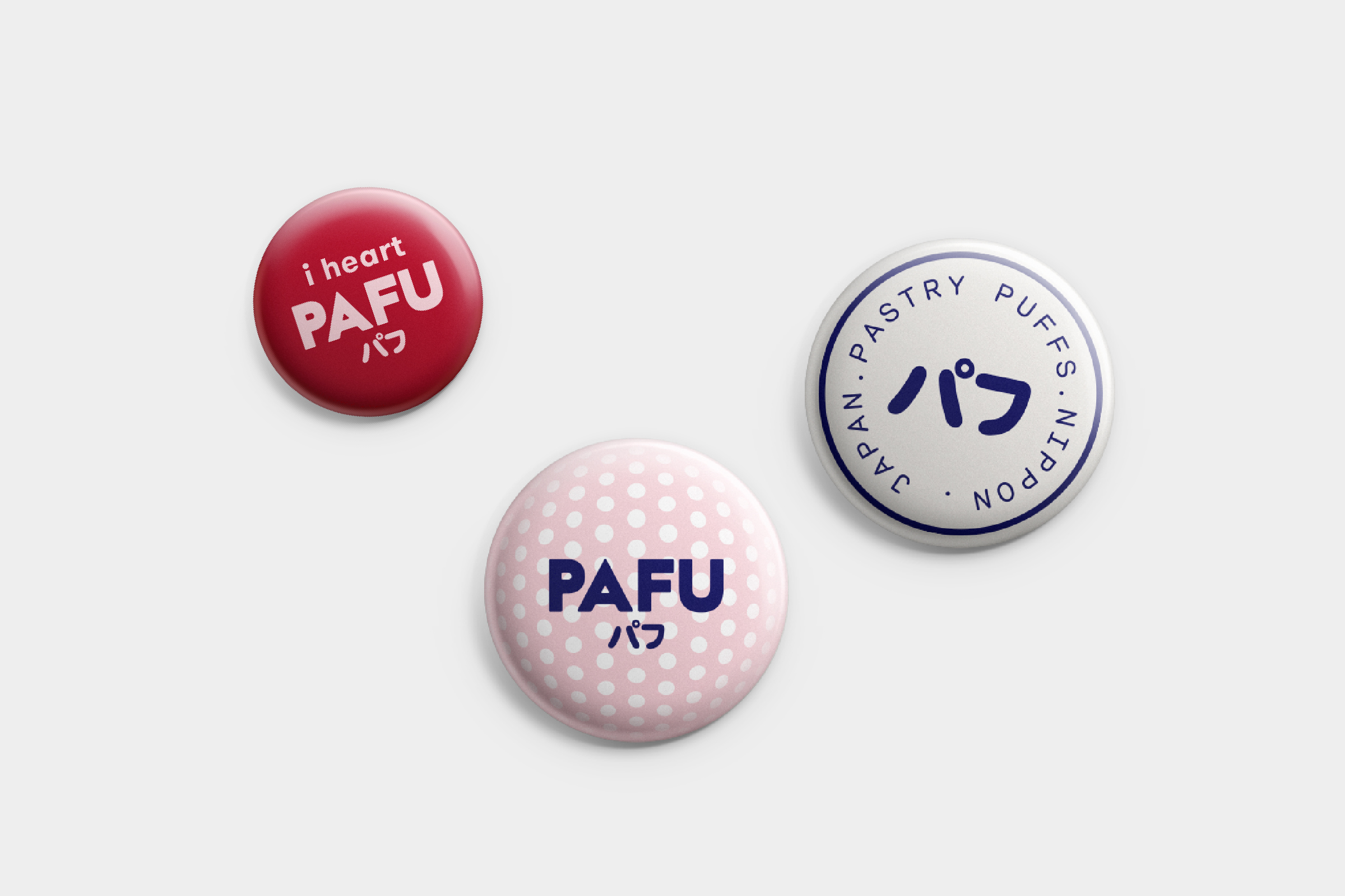
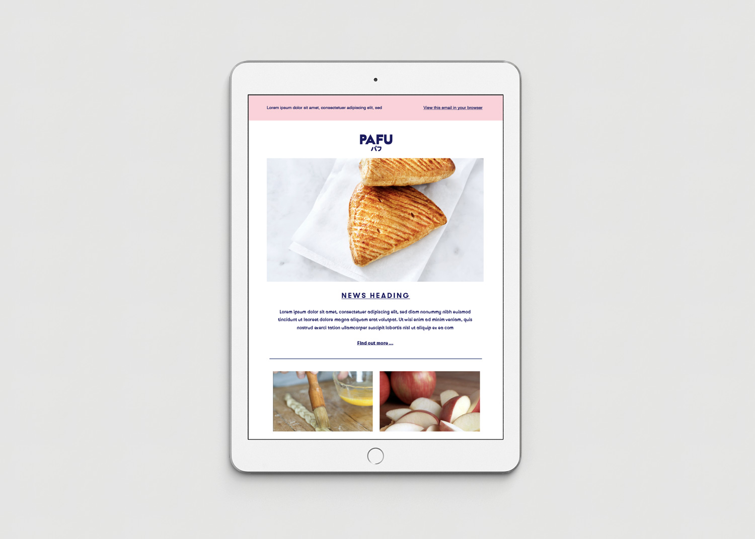
Pafu パフ
品牌策划、品牌设计、命名、文案、包装设计。
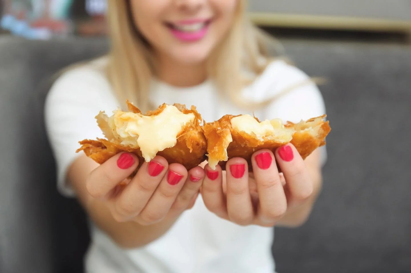
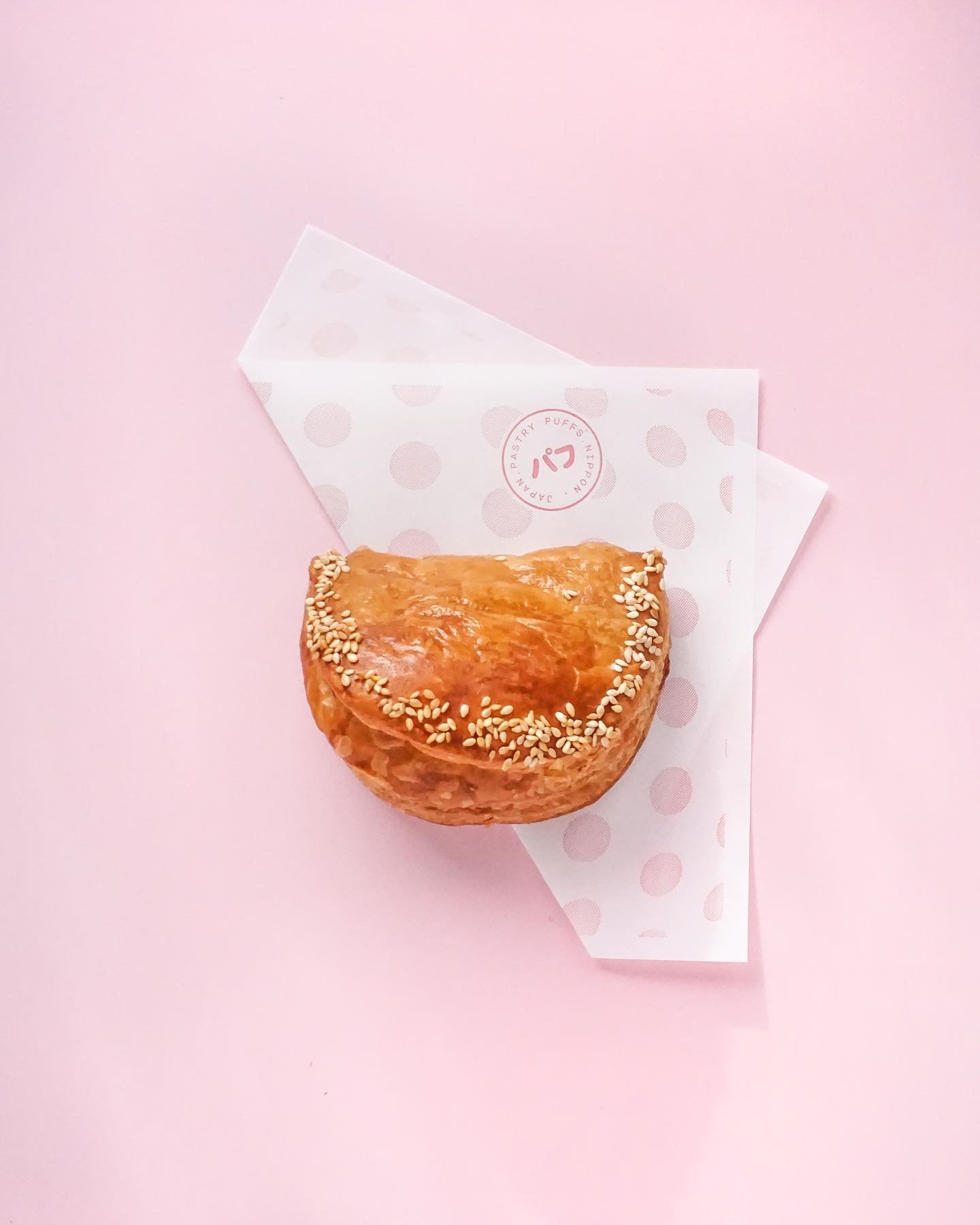
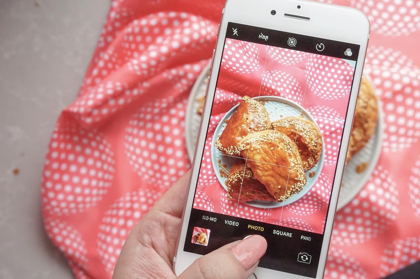
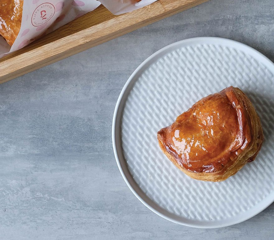
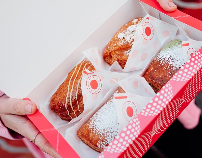
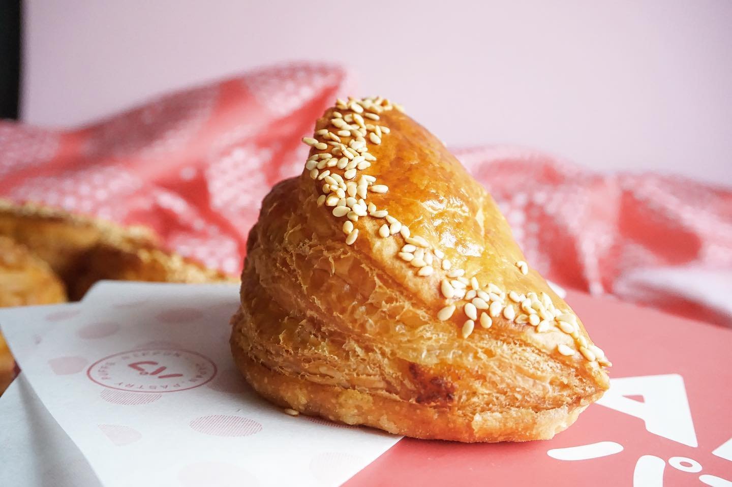
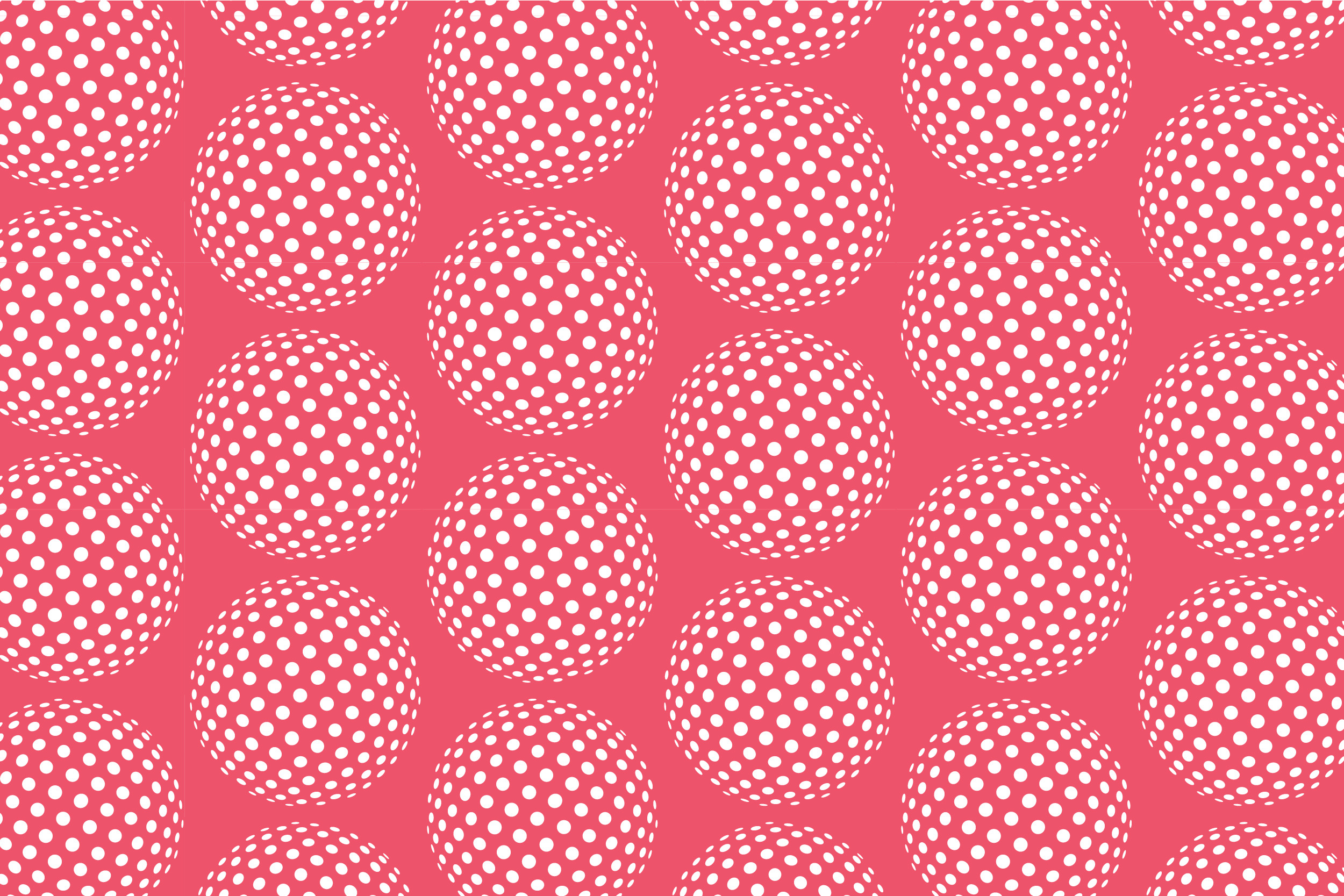
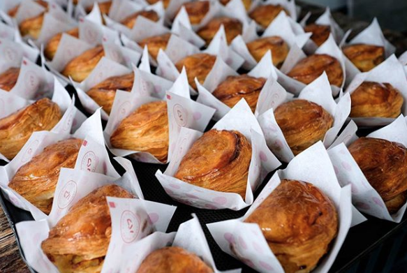
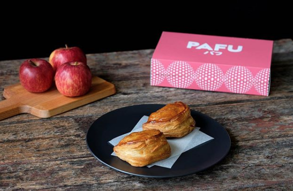
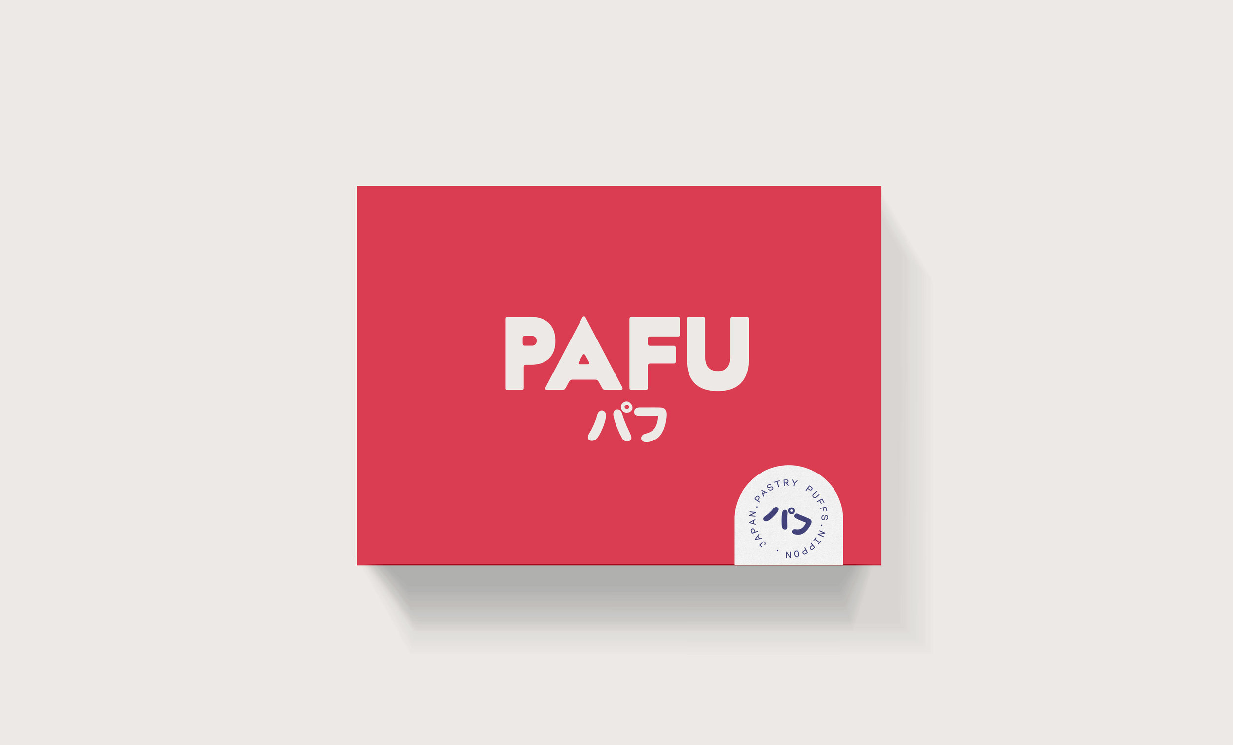
Apple turnovers gets reinvented. Almost retro, nostalgic and Margret Fulton-esque, BrandWorks was engaged with re-introducing a European dessert classic to the millennial taste palette. Adding to the twist, the concept’s strong connection with Japanese pastry techniques and minimalist design aesthetics formed the key components to the brand, visuals, language and packaging. The soft fluffy layers of pastry surrounding the creamy custard apple filling inspired not only the typography but the soft tonal colour palette and use of optical print to communicate the explosion of flavour with every bite.

Images & video courtesy of Pafu, T A-Square Architects.

Credits @pafuaus

查看 品牌宣传片