Longtime (Branding)
Strategy | Branding | Collateral | Interior

Cathedral
of Good Times


Client
Milk Madu Group
Sector
Restaurant
Bar
Services
Market Research
Concept Development
Customer Experience
文案写作
Brand Creation
Logo
Brand Assets & Style Guide
Print Collateral
Uniform
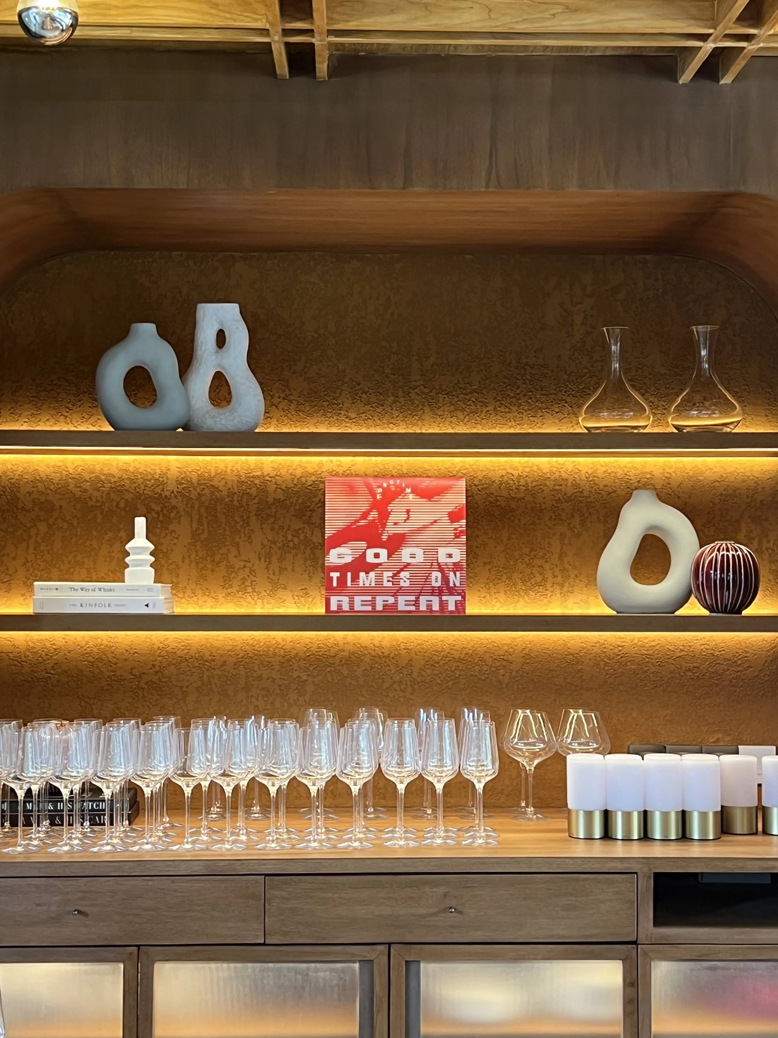
Interior Concept
3D Renders
Construction Documentation
Interior Styling
指示牌
Social Media Content/Management
简介
Longtime, founded by hospitality experts Jordie Strybos and Pablo Fourcard from the Milk and Madu group, offers a unique dining experience that blends contemporary Asian cuisine with a Melbourne-inspired aesthetic. Set within a stunning warehouse with double-height ceilings, Longtime is where guests can eat, drink, and enjoy good company. The restaurant is known for its bold and unexpected flavours, capturing an untamed Asian spirit in an understated yet chic environment.
设计方案
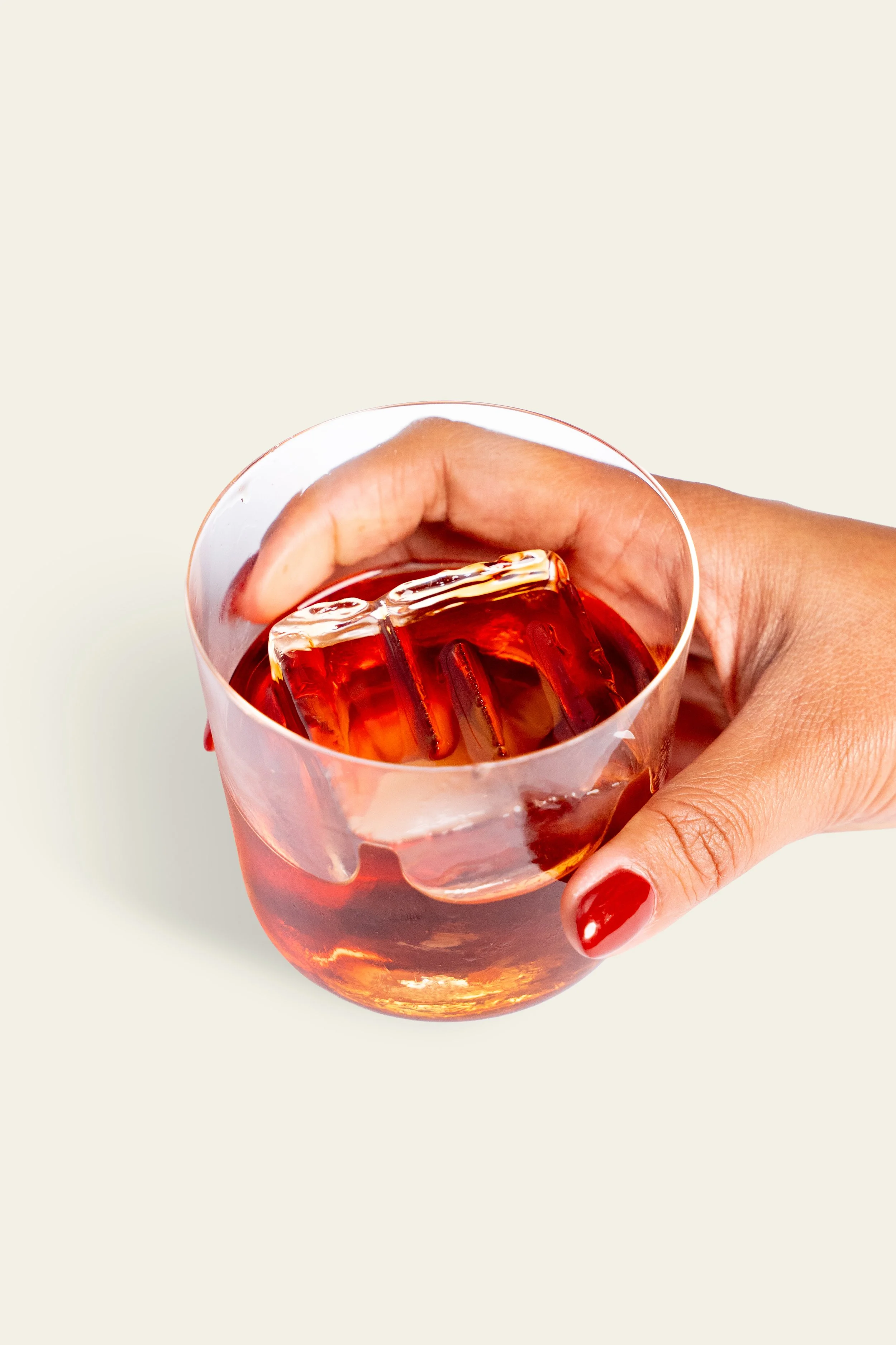
The brand effortlessly mixes and dials it up a notch or two, straddling the intersection of hot ‘n spicy, sweet and sour, chaos and balance. With an approach that celebrates the fusion of East and West as seen through a Melbourne lens, BrandWorks blurs the lines and bends the rules as they say. It's all about people and the good life, where guests are welcome to stay a while longer. Every decision we make is considered and well thought out, exuding our understated style and purpose.


Outcome
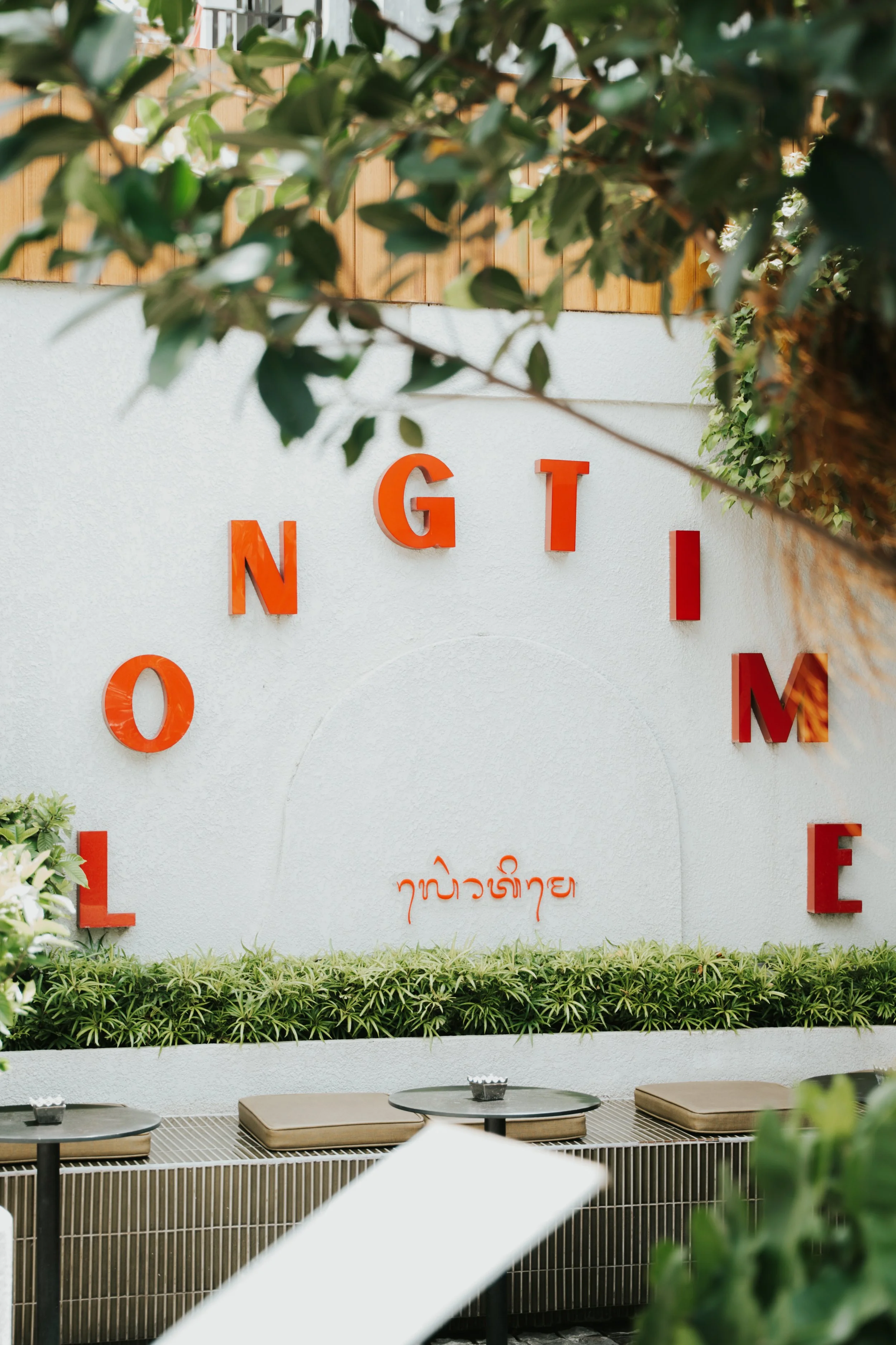
The name "Longtime" was inspired by the idea of creating a place where guests can lose track of time, fully immersing themselves in the experience. It reflects a sense of nostalgia and connection, evoking the warmth of reunions and lingering conversations with friends and loved ones. The name also hints at the enduring quality of the memories created there—moments that will be cherished for a long time.
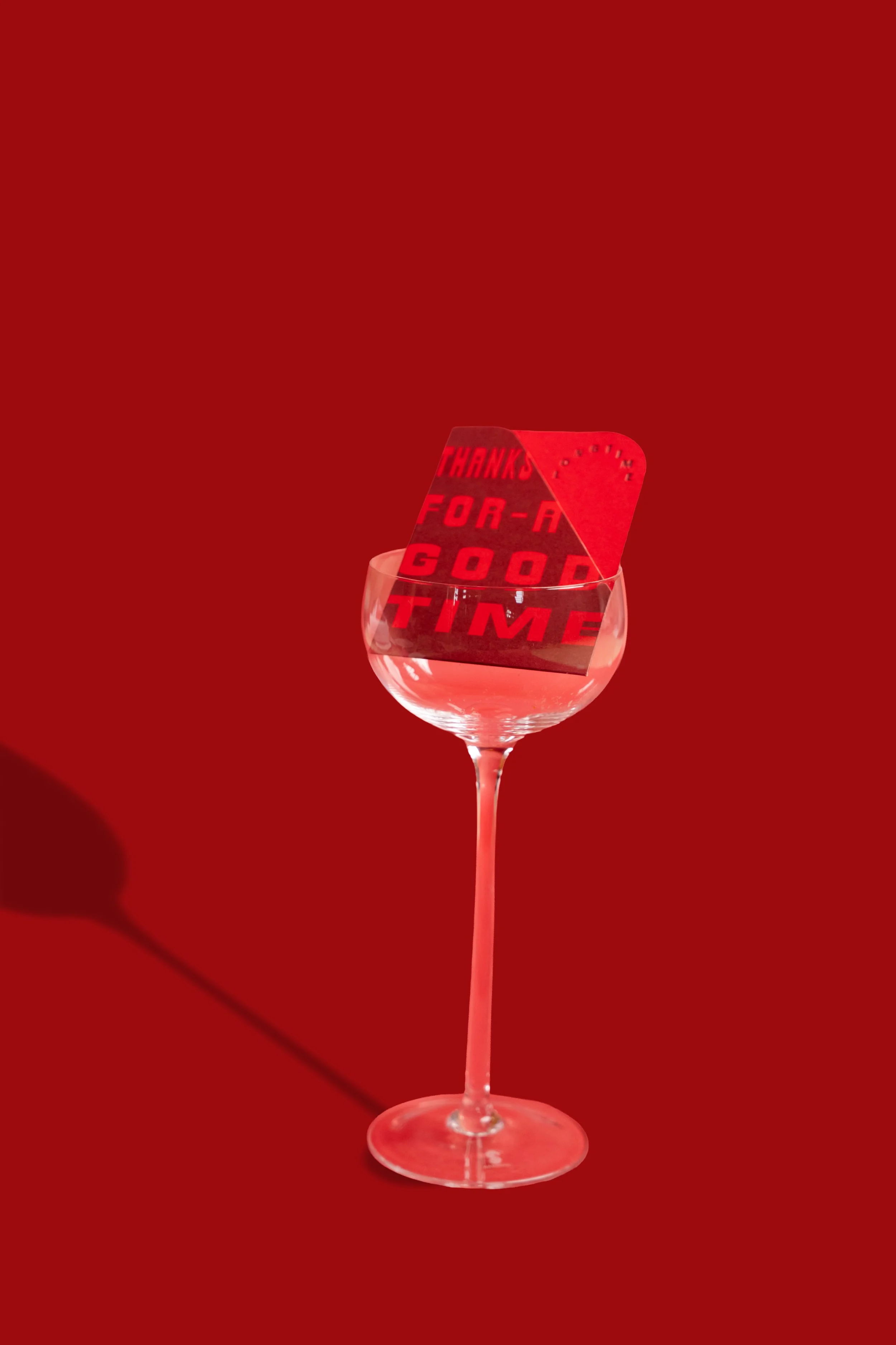
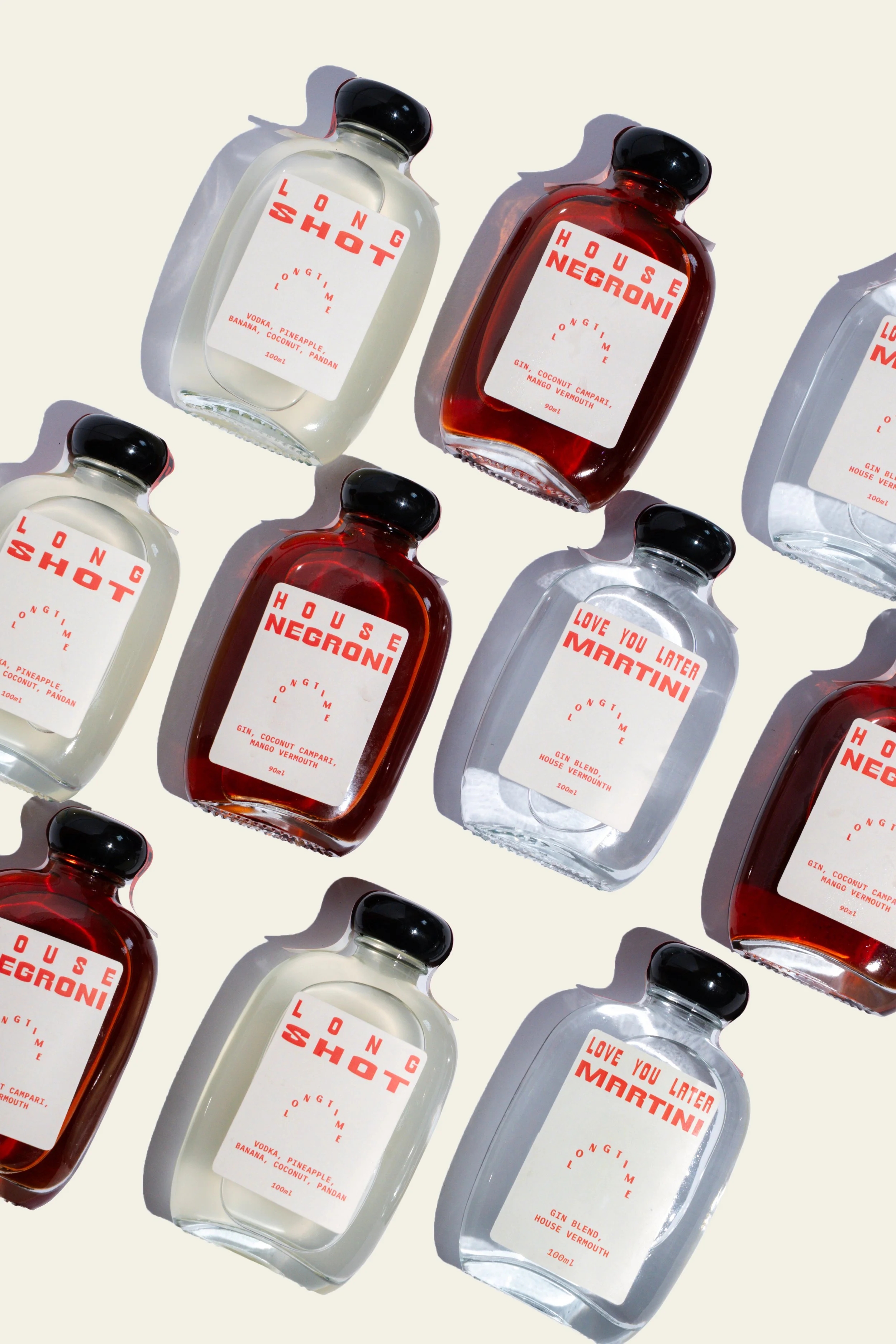
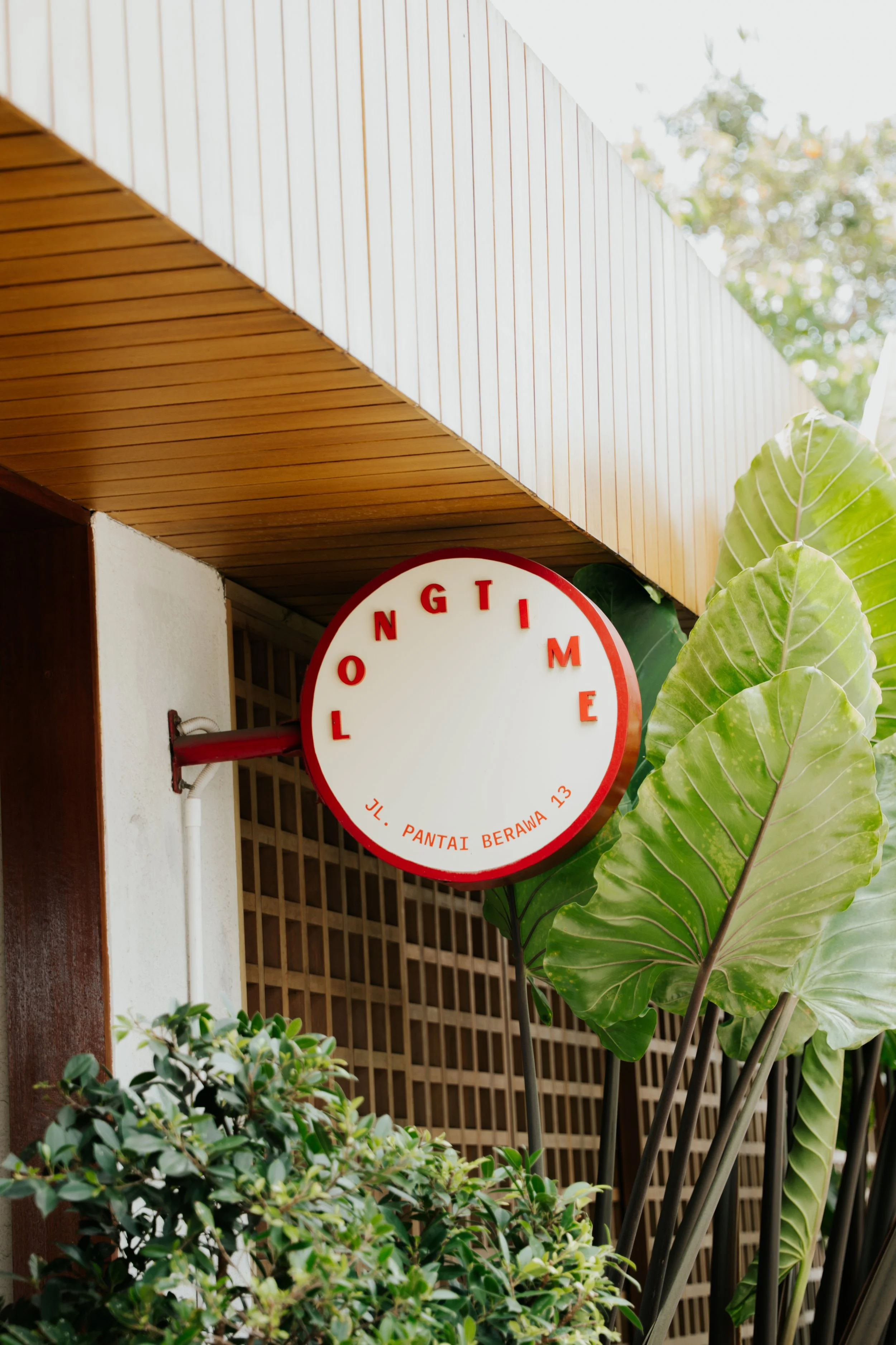
The brandmark for Longtime is a bold and expressive representation, carefully crafted to reflect the essence of the venue. Inspired by the shape of the arc windows and the passage of time, symbolized by the sun and light, the design embodies the idea of enduring experiences and timeless moments. The classic black and white colour palette provides a strong foundation, while the addition of a youthful and slightly retro mix of pink and red injects energy, emotion, and a sense of vibrancy into the brand's voice.


The design makes effective use of negative space, allowing the bold and maximalist content to stand out without overwhelming the viewer—this approach mirrors the concept of "controlled chaos" that defines the venue’s atmosphere. Textured graphic effects, such as halftones and graphic marks like tape, along with hand-drawn elements, add a layer of humanity and artistic depth to the brand. These touches ensure that the brand feels dynamic, creative, and full of personality, avoiding any sense of being clinical, dull, or basic. The overall result is a brand identity that feels authentic, engaging, and memorable, perfectly capturing the spirit of Longtime.